The colour red has always been a bold and beautiful option in the colour wheel, and so there is no surprise that many have embraced red hues in their home and office interiors. What you might not know is that there is more to mastering the tone than just furnishing your rooms with red curtains and a couch… you have to be more methodical as the colour has the potential to cannibalise a room and make it either too overpowering or tasteless. If you have your heart set on red, then here is how you can style your interiors beautifully with it.
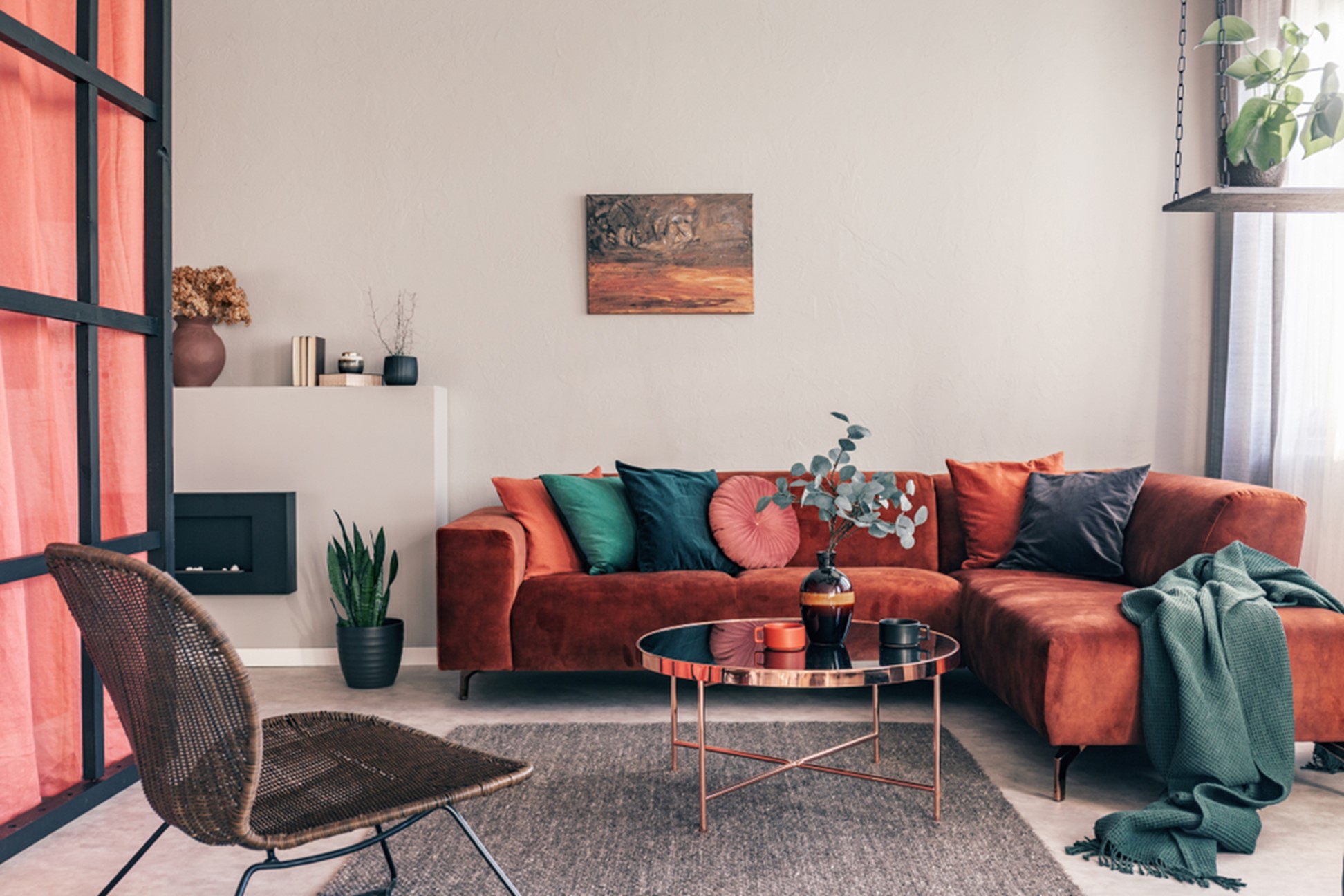
Impact Over quantity
Red is very memorable and attention-grabbing, which means you don’t have to have a floor to ceiling room to get your intention across. In fact, your red hues will carry less if they are clustered in high volume and not standing out against whites and other neutral tones. Choose what pieces in your home or office need to be red, and work on highlighting them through better placement around the room. Furniture, curtains, art and books always look good as statement pieces, so avoid getting a red carpet or wall as this will saturate the feel of the room.
Which Red?
There is a lot more to choosing a colour and putting it in your interiors, otherwise, everyone would be a stylist or have their home on the front of a magazine. There are literally hundreds of red hues out there and you want to be honing your selection to about three complementing red hues so that you can explore the depth of colour but still keep to a theme. Will this make shopping for your new red interiors more challenging? Yes, but the result will be a flawless showcase of your chosen red hues. Bright, muted or something in between – get your hands on some paint swatches so you can see what colour tones speak to you most.
Fashion Or Function
There is also a possibility that you have never considered styling your space red but have bought or inherited a room that has reds already in it. Working around these hues is always going to be more affordable than renovating to start new, so identify the character and style of the existing red pieces and try to not only match in colour but origin. You also want to understand if these accents are stylistic choices or actually functional (like a bench, for example). Are your existing interiors retro, classic or contemporary? Understanding this persuasion at the start will guide you to other pieces that will be a perfect fit for the home.
Balance Is Key
As we earlier discussed, your reds are to be used sparingly so that you achieve a balance and can stand back and admire those bursts of red. Balance can be achieved not only with the neutral tones your reds sit against but with natural light. A great light source is going to show a gentler side to your reds so try and incorporate as many complementing light sources as possible – through windows, skylights and even glass panes on doors. Another easy way to maintain balance is by remembering that whatever you add to your interior, you have to add an opposite effect like white.
Let the takeaway message be that styling around red hues can be a lot of fun and quite striking if done correctly. We can all learn to be DIY stylists, but if you need some expert help – reach out to a professional to ensure you are on the right track.